Monday 24 February 2014

Deconstruction On Editing Effects Used In Paranormal Activity

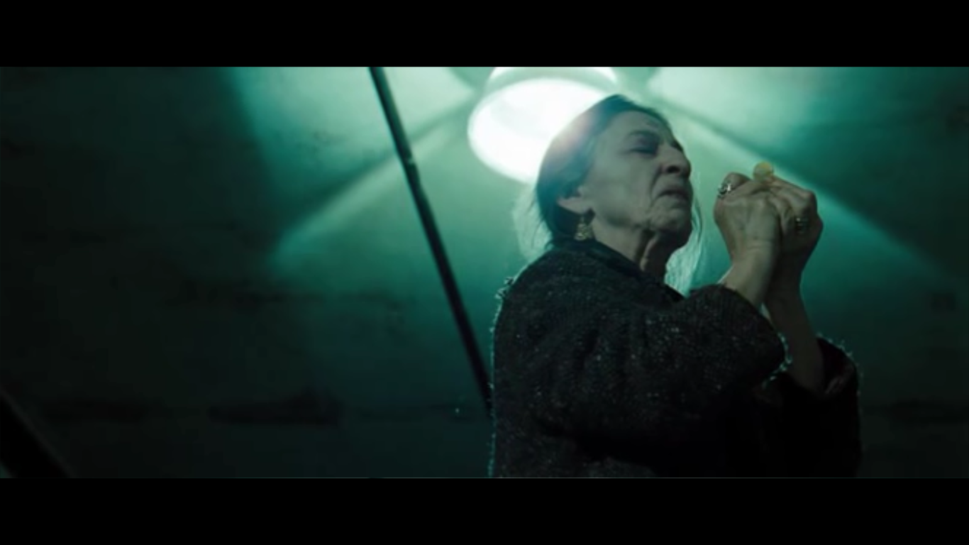
Visual effects have mainly been used throughout the film. One key example is of the CCTV effect. The CCTV effect connotes the idea of the film being filmed like a documentary. This helps to create realism.


Other visual effects have been applied such as the "black eyes". The effect is a convention used for many supernatural horror/possession films such "The Devil Inside" and "The Possession". It is therefore, useful in conveying the genre and more specifically, the sub-genre of a horror film - supernatural horror.
The effect is useful in representing a possessed character, as the black, gloomy colour carries  negative connotations such as evilness.


Sound:
  • Off-screen diegetic sound of a roar has been applied to the possessed woman (at 1:46s). The sound effect signifies possessive movement.
Evaluation:
  • The CCTV effect can easily be achieved on Final Cut Pro. A green filter can be applied to create a CCTV effect similar to the one from "Paranormal Activity".
  • The visual effect of people being dragged cannot be achieved through Final Cut Pro. However, in my group's opening, the possessive movement which we have included requires fast movement to convey bone clicking, possession etc. Instead my group and I have sped up the possession parts in our opening. Our sped up clips appeared out quite well, meaning having the "dragging" effect absent should be okay.
  • The "black eyes" is a visual effect which would be helpful in our opening. The effect is effective in further building on the idea of possession.

Friday 21 February 2014

Transition Editing

 
In the beginning of our two minute supernatural film opening we had to put in an original film production company, our own film production company and our film name. We, as a group chose 'Warner brothers' as our original film production company, 'Fright Films' as our own film production company and 'The Possessed' as our film name. This is what it looked like before we added in any transitions when it was simple blocks with straight cut edits.


We then added the transition 'fade to colour' from final cut pro which created a slight fade between each bit of film, we also added 'breaks' (black spaces) in between the transitions to drag it out a bit longer so that it didn't go too quickly from one part to another and we thought this looked more effective overall.


This is what we ended up with:

 
Evaluation -
It took us a while to get used to using the transitions on final cut pro as we found them quite tricky to place where we wanted them to go at first. But we both agreed that using that particular transition along with the blank spaces made the beginning of our film opening look as effective and professional as want it to be. We want to continue editing this with the rest of our group to add any improvements they think can be made, and also to put some non-diegetic sound in the background of the film name.


Wednesday 12 February 2014

Drag Me to Hell Deconstruction - Demon

I decided to take a closer look at a demon and possession sequence from the film 'Drag Me to Hell'. I felt that exploring other films to see what kind of demons they use would be useful for us and coming up with our own. The attention to detail they have regarding the demons and spirits is very precise and they obviously thoroughly research them first, to make sure they make them seem as scary as possible.

In this film there is mention of a demon called 'Lamia', who haunts you for 3 days and then drags you to hell. This is a real mythological demon who was a beautiful queen but turned into a child-eating demon. There is also the appearance of an old woman with one blind eye, rotting teeth and scraggly grey hair, who altogether looks very frightening and old. She curses a button, which sets off all the possession type activity that occurs. 

During the film they keep the appearance of the demon quite ambiguous. They only show it in shadow form, which is quite effective accompanied with screeching non-diegetic sounds (string), as it keeps the demon as a supernatural unknown being, meaning it could take any form, which will ultimately scare the audience. Furthermore, they give the demon a quite stereotypical translated name - 'the black goat'. 


It is quite stereotypical to associate evil with black. Also, many people associate goats with Satan-worship, due to some old symbols. As well as this, the film uses other generic demonic things, like flies, which can be seen in many others films e.g. The Ring. This insect is usually regarded as filthy and so watching it go into a woman's mouth makes the audience feel unpleasant and disgusted. 

They also use old scripture type books in the film to show the audience what the demon looks like in mythology. Again, it is a goat, which links to the Satanic idea that they are trying to put across. They also use this to tell the story, as the images help depict what the man is explaining. 

The demon also has the ability to possess and this is done in a conventional way. When the woman is possessed her eyes roll back into her head and she begins speaking in a way that sounds unnatural and contrapuntal to the woman's appearance. He also possesses a man and gives him the ability to fly, which is not something that we'd be able to recreate as it would be impossible for us, given our minimal budget. However, this just makes the demon seem scarier as it is able to do unnatural things. 

Continuing Editing

For my practical task this week I decided to continue editing our 2 minute opening. I left a gap between what was already done and the part I had started, which would be moved later. I decided to edit the part where the girl is going crazy and then the lights black out, there's darkness and then the lights come back on and the girl is no longer there.

Firstly I selected the clips I was going to use which required careful selection and comparison between clips. Then I used the blade tool to crop bits off that were shaky or too long, as this would make our sequence look unprofessional.

Luckily, when we filmed this part of our sequence we remembered to leave darkness for a few moments before turning the light back on, making the editing process a lot quicker and easier. I then stitched the sequences together. 

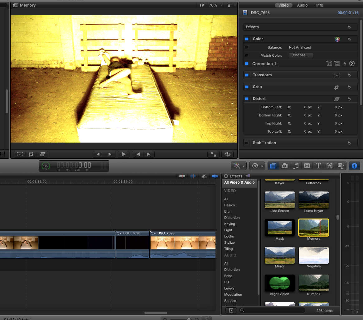
Following this, I played around with the colouring of the clip as the light slightly distorted parts of it, so this is one i looked at. It is obviously too yellow and in the end I decided on just adjusting the contrast and hues of the clip, if we are to use this in the end definitely then we'd have to apply it to all the clips.


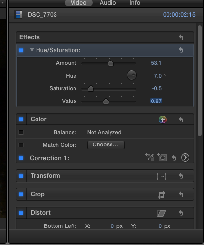
These are the settings I used for the clip in the end, I sightly adjusted the hue and saturation of the clip so that they match better, as seen when you watch it. However, in the next part of the sequence the girl jumps up in front of the camera and there is an issue; the lighting is slightly different, meaning we will have to use our editing skills to make this appear more professional.


After this, I detached and muted the audio. We will later add the sounds.

Evaluation:
Later when we come to edit this more, we'll have a non-diegetic sound, then silence, the a loud noise e.g. a boom when she jumps up. I liked the saturation etc that I used, however, this may prove a nuisance for editing the rest of the sequence, plus it may look weird in other lighting. I am pleased though with the results and want to now look for non-diegetic sounds to use over the top.

1.14 Onwards:

Monday 10 February 2014

Possession Editing

Through research into films of the supernatural horror we noted that a simple yet effective technique to emphasise and add to the possession feeling was to take different segments from a long clip and put them in a different order in quick succession. This editing technique makes the movements of the individual seem much more jolty and unnatural which conforms more to the supernatural horror genre than a human's real movements.


We selected a relatively long clip which is made up of a single take and located parts of the clip which we found had good movements which were able to be edited well to good effect using this technique. The clip we chose is one of the raw takes from our opening sequence which features during the early stages of possession. 


During the first attempt, we separated two segments from the clip and changed the order in which they appeared in the clip. This first attempt resulted in the segments being far too long which did not make the character's movements seem possessed and unnatural. This meant that the cuts between the shots were not quick enough in order to create the desired effect. Also, the clips were taken from an area of the main clip which are too close together resulting in similar movements of the possessed character. This means that the audience would not be able to decipher the changes between the cuts as easily as if they were taken from more obviously different parts of the clip.


Our second attempt worked well as the segments were much shorter which meant they were much quicker when played back, giving a stronger sense of possession. Despite this, I thought that the segments could be shorter in length to speed up the changes between segments to further create a sense of possession within the character's movements.


The segments created were quicker which made the sense of possession feel much more intense and which conformed more to the supernatural horror genre. The quick cut edits between the segments made the overall clip seem much more unexpected and sudden which resulted in a much more possessed-like clip in general. The sudden nature of the editing used in the clip makes the possessed character's movement seem much more shocking to the audience and are made more effective than if we decided to use natural movements.


Even though we were satisfied with how the editing made the clip seem much more effective in how a sense of possession was presented, we decided to make the segments even shorter and put them in even closer proximity. This resulted in a more effective outcome as we concluded that when the segments are shorter and the clip is made more abrupt in general, the more possessed the character seems. The clip was trimmed at the beginning and end to only show the part which we edited and experimented on. The final clip from our experiment can be viewed below.


Wednesday 5 February 2014

Sound Deconstruction On The Devil Inside


  • The sequence first begins with off-screen diegetic sound of screaming (at 0.00s). The screaming creates an enigma within the audience, as the audience cannot see who is screaming and where it is coming from.
  • The audience can also hear off-diegetic sounds of objects smashing (at 0.03s). This further builds to the climax.
  • At 0.06s the audience hear on-screen diegetic sound of a woman roaring. The audience can also hear on-screen diegetic dialogue which is quite fast paced e.g. "we need to get her under control" (at 0.14s). Therefore, the audience can see this scene to be quite tense. From the use of diegetic sound such as the roaring, the audience can also note the genre of the film.
  • The on-screen diegetic sounds of the woman clicking her bones (at 0.18s) is conventional to the sub-genre, allowing the audience to build their understanding of the narrative. Furthermore, by the identifying the sub-genre (a possession film), the audience can note a possessive movement is taking place.
  •  The absence of non-diegetic sound creates more realism, making the scene more realistic. 

Sunday 2 February 2014

First attempt of adding titles


We decided that the name of our film was going to be 'The Possessed' which then meant we were able to experiment with some title fonts. We put it after our production company but we are still undecided where it is going to be placed and whether we will overlap it with a piece of our filming. At first we looked at quite plain fonts to see what would look the most effective.


We both decided on a font we liked the best called 'Trajan Pro' as we thought it fitted our opening the best, we then added some effects to it such as 'Bad TV' which blurred it and made it jolt around like a recording camera, we thought this looked effective. But this is just one of many ideas we can try for our titles and discuss with the rest of our group.


This is a rough edit of the title put in with what we have edited so far, to show the full effect we have put on it:


Evaluation:
We both agree we like the font that we chose, and we will show it to the other two people in our group to see if they agree with us. If this is what we choose to use as our final titles, our next job will be to properly edit them in with the rest of our filming so it runs smoother than the example we have displayed above. We may experiment with some more font types and effects to see if we like any others better than the one we have chosen, but if not this will be the one we go forward with.