Monday, 14 July 2014

Gender Politics in the Film Industry

Gender Politics 

History of Gender Inequality in Film

Gender inequality in film is a large talking point in today's society, although it has been largely debated and talked about for many decades. The idea of gender inequality in film surfaced as what is known as "feminist film theory", influenced by second wave feminism and developments of women's studies across the western world. Feminist film theory was first brought to the attention of the general public through the works of feminist scholars, such as Majorie Rosen's 'Popcorn Venus: Women, Movies, and the American Dream' (1973) (left) and Molly Haskell's 'From Reverance to Rape: The Treatment of Women in Movies' (1974) (right). Feminist scholars such as Rosen and Haskell were the first to take cues from second wave feminism and turn the ideas of the movement as a whole towards film and began analysing how women were portrayed in film and how it linked with the broader historical context, as well as the stereotypes depicted and how much screen time was given to women.

Current Statistics

New York Film Academy
Plenty of research has been undertaken to analyse different aspects of the extent of women in films. One piece of research I looked into is by the New York Film Academy which gives a visual interpretation of some statistics focusing gender inequality in film (right). Some of the statistics the study showed were that:

  • on average, only 30.8% of speaking roles are given to women
  •  28.8% of women in film wore sexually revealing clothes (while 7% were men)
  • 26.2% of female actors get partially naked (while 9.4% of men do) 
  • only 10.7% of films featured a balanced cast where half of the characters are female and half are male
  • the average ratio of male actors to female actors is 2.25:1 
  • the percentage of teenage females depicted with some nudity has increased by 32.5% from 2007 to 2012.

These statistics show that although gender inequality in film was first debated and talked about almost four decades ago, it is something which is very common in today's film industry and its severity, in some aspects, is increasing a huge amount in a little amount of time.

The video below is from an Australian News Channel, 'Sunrise', which gives a brief debate concerning the disparity of men and women in film. Much of the content of the video focuses on statistics very similar to that shown in the study by the New York Film Academy. 

A study by griid.org, similar to that of the New York Film Academy, presents information which highlights male dominance and gender representation in the film industry, focusing on some of 2012's biggest Hollywood blockbusters. 
  • A statistic gathered by griid.org which shows clear gender inequality in films is displayed visually (right). The statistic shows that in 2012's top grossing films, only 12 of the films' main characters were female whereas 55 of the films' main characters were male. This clearly shows the extent of male dominance in the film industry and how unbalanced the ratio of male to female main character in major films.  


Thursday, 1 May 2014

Target audience


We have decided on various aspects regarding the target audience for our film opening, taking into account demographics of recently-distributed existing films. Details of our film opening's target audience:
  • We have decided that the age certificate and minimum viewing age of our film opening is 15. This is because we feel that some of the possessed parts of the sequence are inappropriate for anyone under this age. We also decided on this age certificate because many similar, recently-distributed existing films of the horror genre hold a 15 certificate. These films include 'The Conjuring', 'The Possessed' and 'The Cabin in the Woods'.
  • The age demographic of our target audience is 15-30. The maximum age of 30 is because we feel that the film opening is likely to mainly attract a younger demographic due to the 'jumpy' content designed to scare the audience. 
  • Individuals who are enthusiastic and have interest in the supernatural horror genre. This means our film opening is primarily aimed at people who enjoy supernatural horror films and have experience in viewing this type of film. 
  • Although both genders are included in the target audience of our film opening, male individuals are more narrowly targeted than females of the demographic age of 15-30. This is due to the results of a survey we carried out which showed that males are more likely to choose to watch a film of the horror genre than females are. Despite this, we ultimately felt that our film opening should be aimed at both genders in order to attract the largest audience. 

Saturday, 19 April 2014

Sounds To Use

After further researching into legal free sounds, I found a website appropriate for what my group and I needed. The website I found is known as 'Incompetech', below is a step by step process of what I did in order to receive the ideal sound for my groups' opening.

I selected "Royalty-Free Music".
The website then gave me an option box which allowed me to select a genre - horror. The options also offered me certain "feel(s)" for my sound. I selected "dark, eerie, intense (and) suspenseful".
Here are the names of the sounds I received. "The House of Leaves " is the one I chose.
 

At 1.10s, the non-diegetic sound begins.
Evaluation:
  • The sounds I found are more suitable with our opening. The sound my group and I used is effective in creating the suspenseful atmosphere we needed.

Tuesday, 8 April 2014

Target Audience + Genre Conventions research

Before we even started to plan our film opening in any detail, we had to decide on a target audience. As we decided to make a horror film, it was almost impossible to have the age rating as under 15 because horror films are almost always scarier and more intense than any other genre. As well as this, we looked at our sub-genre, supernatural horror and took inspiration from their age rating certificates.

Some of the big supernatural horrors at the moment and their minimum age ratings are:
  • The Possession - 15
  • The Conjuring - 15
  • The Exorcism of Emily Rose - 15
  • Paranormal Activity - 15
Clearly, a common age minimum is set at 15. This means our target audience ranges from 15-25, teenagers to young adults as this would seem most appropriate for our film genre. 

So what kind of content can we show and what can we do to attract the target audience? 
  • As we have quite a young age group (15) it would be more appropriate for there not to be as much gore as a slasher film and also this would not be conventional for our genre
  • We also have no swearing or foul language as this would make it age appropriate and allow the 15 rating.
  • We also decided to use a little girl as the main character as this is conventional and would attract the intended audience. Another convention we stuck to is the use of a 'jump' at the end of a long sequence, to thrill and shock the audience, which is something the audience expects.
  • We also decided to name our piece 'The Possessed' as this is clear and conventional, the article 'the' is a conventional word to use in the title for a supernatural horror and so it is clear to the audience the genre of the film.
How can we represent the social group (age)?
  • We are using a young girl in our piece and so we wanted to think of ways to represent her. One commonly accepted view of little girls is that they are vulnerable and so need protection. 
  • Clearly, a possessed girl shows huge signs of vulnerability and perhaps the audience will feel sympathy at first.
  • But during our sequence we wanted to make it seem like she was no longer a little girl on the inside, so we used non-diegetic growling noises, non-diegetic bone clicking noises. This all helps the audience see the little girl as a threat and as dangerous instead

Sunday, 16 March 2014

Research Into Un-copyrighted Sounds For Opening

After my initial research into existing sounds used for Supernatural Horror openings, I had to find un-copyrighted music, which would potentially be used for our opening. In order to ensure the music I found did not have copyright, I searched for "royalty free" music. Below are possible theme music choices which could be used.

This soundscape would be effective between the transitions of our existing title production companies. The sound has dark connotations, which would match the graphology in terms of the gloomy colours in our existing title production companies. The non-diegetic sound gradually increases in volume, creating suspense. This suspense effectively places audience in a position of fright.

The music box tends to be a convention commonly used in supernatural horror films e.g. "The Conjuring". The sound could be a signifier of a young age group, which would be appropriate for our opening, as we have a young girl as the victim of possession.


This sound clip uses the music box again but this one however, sounds more sinister. The sound at 0.22 seconds sounds rather eerie and would therefore be appropriate for our opening. 

 The following is an exorcist theme sound.


Evaluation:
  • After carrying out my secondary research, I found it was quite hard to actually find un-copyrighted music.
  • After compromising with my group, we agreed that we needed a sound more eerie. Now I shall go and find a website specialising in sounds.

Editing main title

The main title is a very important part of an opening sequence, especially those of films in the horror genre, as it acts as a bridge between the opening sequence and the main body of the film. It also acts as a conclusion to the opening sequence which is designed to pull in the audience from the start so they have interest in the rest of the film. This means that how the main title is edited and presented is crucial in how it carries the rest of the film.

For our main title, I decided to use the editing technique 'bad TV' on the Mac program Final Cut Pro. One of the main reasons I decided to use 'bad TV' was because I had to keep the aesthetics of the title very similar to the previous titles which show the cast and crew of our opening.

*insert screenshot of bad tv*

This use of bad TV makes the title seem mysterious and almost as if it is being possessed itself, conforming greatly to the supernatural horror genre.

I also decided to keep the main title visually similar to the previous titles which are shown during the opening sequence by adding different titles in different areas of the screen and showing them in rapid succession so they seem to jump around the screen.

*insert screenshot of multiple titles*

This creates a jolting and uneasy effect which makes it seem like the title is out of control which reflects the events and manner of the possessed character during the opening sequence. I found that adding the same title in different positions is a simple yet effective method to create an appropriate effect which conforms to the eerie and relatively disturbing conventions of the supernatural horror genre.

I also added the 'flashing' effect to the title which makes it seem as though the title is flaring up.

*insert screenshot of flashing*

Although this effect creates an eerie feeling and atmosphere, I feel that it does not quite conform to the supernatural horror genre with the same effect as the bad TV, for example. This is because I feel that the effect it creates is too soft and contrasts too greatly with other editing effects such as bad TV. This also means that the 'flashing' effect makes the title subvert from the conventions of the supernatural horror genre.


Titles

In a previous post we explored the titles and typography, in the end decided on a few effects and transitions to use. I put these into our opening. Here the 3 step title sequence can be seen. They all have the same name, but are positioned in different places with different effects on them. We changed the font to 'Trajan Pro' as felt this looked similar to real horror film titles. E.g. The Conjuring.
In this image you can see that the middle section is a lot shorter. In this part, the bad tv effect is increased to 100, and the text is repositioned in the opposite corner. This gives the text a jolty look and adds to the possessed theme.

These are the settings that the last segment has, in each of the names used. Bad Tv is on the original 'amount', 15.38 after being on 100, however another effect 'flashing' is used to give the burnt out film appearance which reflects some parts in our sequence where quick flahses of pale colour and symbols appear.
Here the 'lighting' effect can be seen fully and it would then transition out with a fade. All the titles are in different places with the flashes occurring in different positions also. The text is overlayed over parts of the opening where Mia is comforting Neve. 

This is what we originally made:


Here are the titles applied to the opening:

-insert video-

Evaluation
I am very happy with this style of title as it looks professional and very similar to the 'Whitechapel' title that we were trying to recreate. However, this will probably get moved around and the speed changed to fit the whole sequence once the sound and editing is completed. For now, the titles are in place but we need to re-jig the order. 


Monday, 10 March 2014

Editing

In the process of achieving our transitions, a shooting error occurred due to camera misplacement between two shots. We needed to figure out how to cover up this anomaly and so we decided to use a flash effect. The flash needed, had to be quick and bright so that the error was unnoticeable. After searching on Final Cut Pro for a good flash effect, we found that we had to use an existing one from a film. The trailer of "Sinister" had the flash we needed (at 1.39 seconds).


We used "KEEPVID" to convert the trailer from YouTube directly to Final Cut Pro.


We then imported the clip onto Final Cut Pro.


Afterwards, we bladed the clip until we were left with the flash.


Now that we had the flash, we could insert it between the two misplaced shots.

Evaluation:
  • The flash we found was incredibly quick, which effectively covered up the error. The transition we made after using the flash, appeared out much better than before.
  • The flash is also conventional to our sub-genre, Supernatural Horror.

Research On Non-Diegetic Sound Used In Supernatural Horror Films

For our opening, we want to have a theme tune which sets a specific mood/tone. The mood we want to set needs to be suspenseful and frightening. This will effectively go well with our possessive clips. After carrying out research, I have found that the soundtracks used in "The Conjuring" happen to be incredibly daunting.

Our existing production companies we have selected are those of "The Warner Brothers" and "New Line Cinema" from the opening of "The Conjuring". I find that the soundtrack used between the transition of these production companies is rather effective. Furthermore, I like the way in which the non-diegetic sound starts of quite subtle and then gradually increases by volume, creating a sense of sudden shock.


For the possessive parts, I thought using a similar soundtrack again would be useful. This is because, at times the possessive movement can be weak, whereas in others it can be forceful. The non-diegetic sound at 0.15 seconds in the clip above has a huge increase in volume. The sound connotes something shocking. Therefore, having this type of non-diegetic sound would be parallel towards the quick, rapid possessive movements, as the movements build climax.
 
I found another sound clip however, which may be more useful when Neve is showing signs of possession. The soundtrack, "The Witch Comes Through" includes a woman screaming in the background which could signify possession. The track also includes heavy use of chiming sounds which can be parallel to the possessive movement.


Towards the end of our clip, Neve disappears. This is a pivotal point in our opening, as audience begin to question the whereabouts of her. Her reappearance is very sharp, with her pouncing in front of the camera. Therefore, it would effective in using a loud sound to which echoes her sudden appearance. The sound clip below includes non-diegetic sounds at the beginning which carry slight emptiness. A similar sound would be useful when the audience see that Neve has escaped from her bed. At 0.30 seconds, the chimes begin to create suspense. After having these sounds, one similar to the impactful sound at 4.27 seconds could be used when Neve reappears.


Evaluation:
  • After carrying out this research I shall now go on to find legal free sounds to use in our opening. I find suspenseful sounds which carry force, would be very useful for our opening.

Tuesday, 4 March 2014

Titles | Research and Practical

Our task for this week was to improve our titles and begin to implement them into our opening. We started by researching different ways in which we could make movements within the titles and took inspiration from the following (Whitechapel):
We liked the way the editors manipulated the text so it would flip, suddenly flash up, become larger and smaller etc. We wanted to recreate this type of text for our own opening.
We found this tutorial whilst searching for different effects we could use and we was interested in trying to replicate some of the movements, however we discovered you have to pay to get this software included in Final Cut Pro and so decided against it, instead we decided to use it as inspiration for our own movements:


We began by using a simple text box in Final Cut Pro, which was basic and plain, starting with the text in the bottom corner. We then put on the effect 'Bad TV' as we use this frequently throughout our opening and we wanted to keep a constant theme throughout, we changed the amount so it was a bit more noticable.
We changed the font to 'Trajan Pro' as felt this looked similar to real horror film titles. E.g. The Conjuring. As you can see below in the screenshot, we put in the actors name and applied the effect. We then manipulated the text in a different way.

 We copied the exact same text but as two different strips of video. Then we put one tiny short clip of text, which appeared for a fraction of a second (saying the same thing) in between.
 In the inbetween one we moved the position of the text to the opposite corner and applied the effect 'Bad TV' for a very short period of time but as a much higher amount, so it looks like it flashes up and goes very jolty and shakey.

Following this, in the longer 3rd clip we applied an effect which looks like a film burning out called '...' which can be seen in the video.


Here is what we made:


Evaluation
We are very happy with this style of title as it looks professional and very similar to the 'Whitechapel' title that we were trying to recreate. To improve we would like to make the text jolt backwards and larger and smaller like in the Whitechapel opening sequence. We also want to try adding in more quick flashes up or in slightly different places just to make it look even more impressive. However, this would require more professional skills and we'd have to download or install other software which could be costly. For now, we are happy with the results.


Monday, 3 March 2014

Editing To Conform Possession Conventions

From my deconstruction task on editing effects used in "Paranormal Activity", I tried out some of the techniques. Below I have demonstrated how I achieved the CCTV look and the "black eyes".

I firstly imported the video into Final Cut Pro. I then used the "blade" tool by selecting 'b' (on the keypad) and cropped the video until I had the image I needed. To apply the CCTV look, I selected "midtones" and applied a green filter.
By changing the "amount", I could decrease the weight of the effect.
 
To try out the "black eyes" effect, I used Adobe Photoshop Editor. I first selected an image to use.
I then selected the brush tool to cover both eyes in a solid, black shade.
After covering both eyes, I changed the colour of the brush tool into white. I then applied the white shade in the centre of each eye to achieve the possessive look.
My final image
Evaluation:
  • Overall, my task went well. The CCTV effect can easily by applied by using Final Cut Pro. However, in my group's final footage, we may just use "bad tv", as this is more realistic.
  • The "black eyes" effect can be applied well by using Photoshop. The effect is inredibly effective in conforming a possessive character.

Monday, 24 February 2014

Deconstruction On Editing Effects Used In Paranormal Activity

Visual effects have mainly been used throughout the film. One key example is of the CCTV effect. The CCTV effect connotes the idea of the film being filmed like a documentary. This helps to create realism.


Other visual effects have been applied such as the "black eyes". The effect is a convention used for many supernatural horror/possession films such "The Devil Inside" and "The Possession". It is therefore, useful in conveying the genre and more specifically, the sub-genre of a horror film - supernatural horror.
The effect is useful in representing a possessed character, as the black, gloomy colour carries  negative connotations such as evilness.


Sound:
  • Off-screen diegetic sound of a roar has been applied to the possessed woman (at 1:46s). The sound effect signifies possessive movement.
Evaluation:
  • The CCTV effect can easily be achieved on Final Cut Pro. A green filter can be applied to create a CCTV effect similar to the one from "Paranormal Activity".
  • The visual effect of people being dragged cannot be achieved through Final Cut Pro. However, in my group's opening, the possessive movement which we have included requires fast movement to convey bone clicking, possession etc. Instead my group and I have sped up the possession parts in our opening. Our sped up clips appeared out quite well, meaning having the "dragging" effect absent should be okay.
  • The "black eyes" is a visual effect which would be helpful in our opening. The effect is effective in further building on the idea of possession.

Friday, 21 February 2014

Transition Editing

 
In the beginning of our two minute supernatural film opening we had to put in an original film production company, our own film production company and our film name. We, as a group chose 'Warner brothers' as our original film production company, 'Fright Films' as our own film production company and 'The Possessed' as our film name. This is what it looked like before we added in any transitions when it was simple blocks with straight cut edits.


We then added the transition 'fade to colour' from final cut pro which created a slight fade between each bit of film, we also added 'breaks' (black spaces) in between the transitions to drag it out a bit longer so that it didn't go too quickly from one part to another and we thought this looked more effective overall.


This is what we ended up with:

 
Evaluation -
It took us a while to get used to using the transitions on final cut pro as we found them quite tricky to place where we wanted them to go at first. But we both agreed that using that particular transition along with the blank spaces made the beginning of our film opening look as effective and professional as want it to be. We want to continue editing this with the rest of our group to add any improvements they think can be made, and also to put some non-diegetic sound in the background of the film name.


Wednesday, 12 February 2014

Drag Me to Hell Deconstruction - Demon

I decided to take a closer look at a demon and possession sequence from the film 'Drag Me to Hell'. I felt that exploring other films to see what kind of demons they use would be useful for us and coming up with our own. The attention to detail they have regarding the demons and spirits is very precise and they obviously thoroughly research them first, to make sure they make them seem as scary as possible.

In this film there is mention of a demon called 'Lamia', who haunts you for 3 days and then drags you to hell. This is a real mythological demon who was a beautiful queen but turned into a child-eating demon. There is also the appearance of an old woman with one blind eye, rotting teeth and scraggly grey hair, who altogether looks very frightening and old. She curses a button, which sets off all the possession type activity that occurs. 

During the film they keep the appearance of the demon quite ambiguous. They only show it in shadow form, which is quite effective accompanied with screeching non-diegetic sounds (string), as it keeps the demon as a supernatural unknown being, meaning it could take any form, which will ultimately scare the audience. Furthermore, they give the demon a quite stereotypical translated name - 'the black goat'. 


It is quite stereotypical to associate evil with black. Also, many people associate goats with Satan-worship, due to some old symbols. As well as this, the film uses other generic demonic things, like flies, which can be seen in many others films e.g. The Ring. This insect is usually regarded as filthy and so watching it go into a woman's mouth makes the audience feel unpleasant and disgusted. 

They also use old scripture type books in the film to show the audience what the demon looks like in mythology. Again, it is a goat, which links to the Satanic idea that they are trying to put across. They also use this to tell the story, as the images help depict what the man is explaining. 

The demon also has the ability to possess and this is done in a conventional way. When the woman is possessed her eyes roll back into her head and she begins speaking in a way that sounds unnatural and contrapuntal to the woman's appearance. He also possesses a man and gives him the ability to fly, which is not something that we'd be able to recreate as it would be impossible for us, given our minimal budget. However, this just makes the demon seem scarier as it is able to do unnatural things. 

Continuing Editing

For my practical task this week I decided to continue editing our 2 minute opening. I left a gap between what was already done and the part I had started, which would be moved later. I decided to edit the part where the girl is going crazy and then the lights black out, there's darkness and then the lights come back on and the girl is no longer there.

Firstly I selected the clips I was going to use which required careful selection and comparison between clips. Then I used the blade tool to crop bits off that were shaky or too long, as this would make our sequence look unprofessional.

Luckily, when we filmed this part of our sequence we remembered to leave darkness for a few moments before turning the light back on, making the editing process a lot quicker and easier. I then stitched the sequences together. 

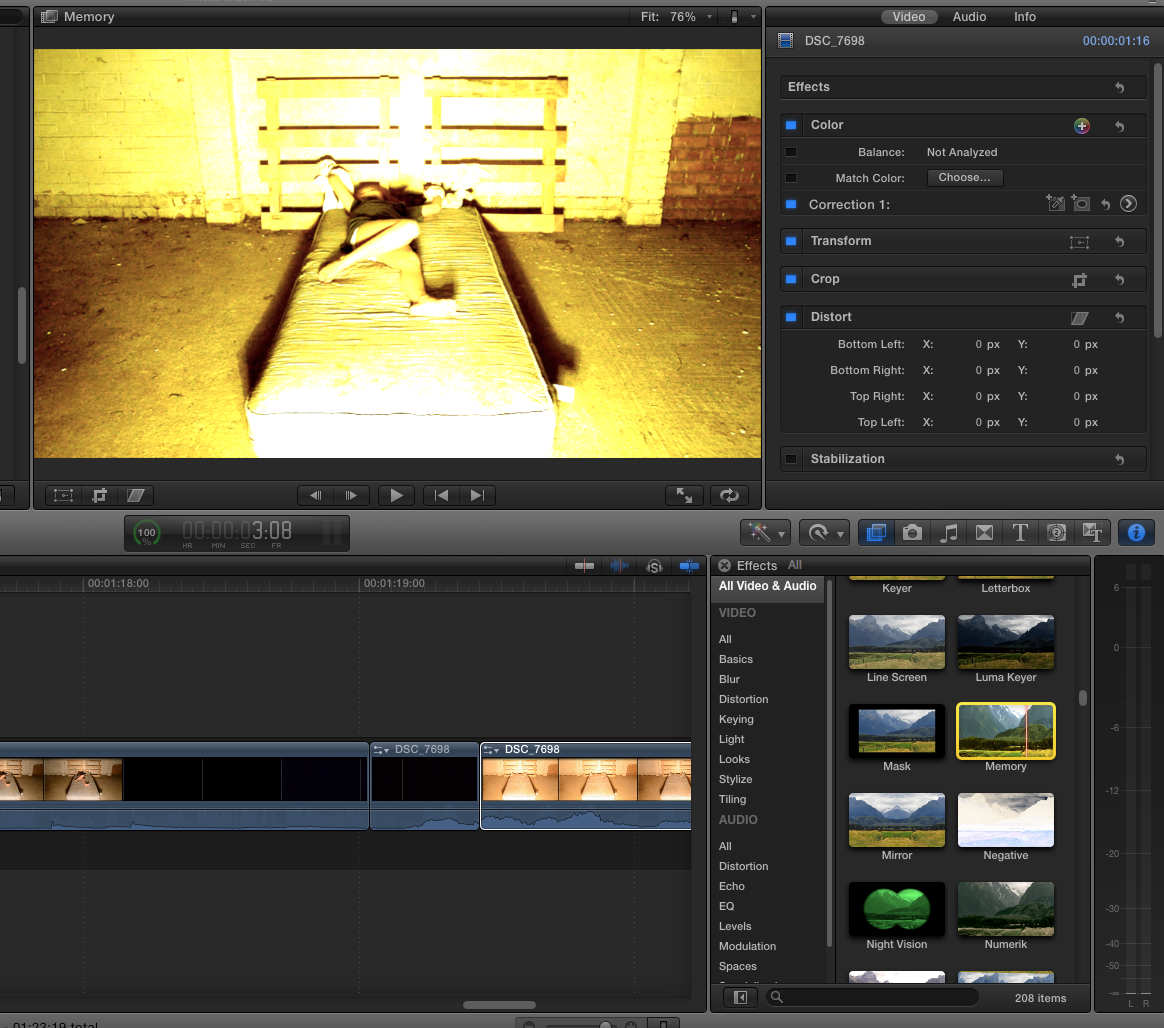
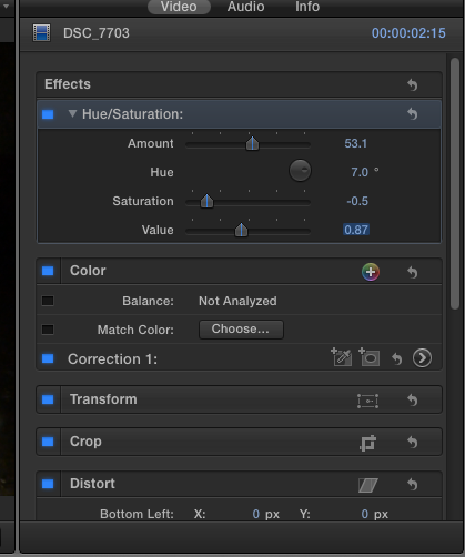
Following this, I played around with the colouring of the clip as the light slightly distorted parts of it, so this is one i looked at. It is obviously too yellow and in the end I decided on just adjusting the contrast and hues of the clip, if we are to use this in the end definitely then we'd have to apply it to all the clips.


These are the settings I used for the clip in the end, I sightly adjusted the hue and saturation of the clip so that they match better, as seen when you watch it. However, in the next part of the sequence the girl jumps up in front of the camera and there is an issue; the lighting is slightly different, meaning we will have to use our editing skills to make this appear more professional.


After this, I detached and muted the audio. We will later add the sounds.

Evaluation:
Later when we come to edit this more, we'll have a non-diegetic sound, then silence, the a loud noise e.g. a boom when she jumps up. I liked the saturation etc that I used, however, this may prove a nuisance for editing the rest of the sequence, plus it may look weird in other lighting. I am pleased though with the results and want to now look for non-diegetic sounds to use over the top.

1.14 Onwards:

Monday, 10 February 2014

Possession Editing

Through research into films of the supernatural horror we noted that a simple yet effective technique to emphasise and add to the possession feeling was to take different segments from a long clip and put them in a different order in quick succession. This editing technique makes the movements of the individual seem much more jolty and unnatural which conforms more to the supernatural horror genre than a human's real movements.


We selected a relatively long clip which is made up of a single take and located parts of the clip which we found had good movements which were able to be edited well to good effect using this technique. The clip we chose is one of the raw takes from our opening sequence which features during the early stages of possession. 


During the first attempt, we separated two segments from the clip and changed the order in which they appeared in the clip. This first attempt resulted in the segments being far too long which did not make the character's movements seem possessed and unnatural. This meant that the cuts between the shots were not quick enough in order to create the desired effect. Also, the clips were taken from an area of the main clip which are too close together resulting in similar movements of the possessed character. This means that the audience would not be able to decipher the changes between the cuts as easily as if they were taken from more obviously different parts of the clip.


Our second attempt worked well as the segments were much shorter which meant they were much quicker when played back, giving a stronger sense of possession. Despite this, I thought that the segments could be shorter in length to speed up the changes between segments to further create a sense of possession within the character's movements.


The segments created were quicker which made the sense of possession feel much more intense and which conformed more to the supernatural horror genre. The quick cut edits between the segments made the overall clip seem much more unexpected and sudden which resulted in a much more possessed-like clip in general. The sudden nature of the editing used in the clip makes the possessed character's movement seem much more shocking to the audience and are made more effective than if we decided to use natural movements.


Even though we were satisfied with how the editing made the clip seem much more effective in how a sense of possession was presented, we decided to make the segments even shorter and put them in even closer proximity. This resulted in a more effective outcome as we concluded that when the segments are shorter and the clip is made more abrupt in general, the more possessed the character seems. The clip was trimmed at the beginning and end to only show the part which we edited and experimented on. The final clip from our experiment can be viewed below.