The main title is a very important part of an opening sequence, especially those of films in the horror genre, as it acts as a bridge between the opening sequence and the main body of the film. It also acts as a conclusion to the opening sequence which is designed to pull in the audience from the start so they have interest in the rest of the film. This means that how the main title is edited and presented is crucial in how it carries the rest of the film.
For our main title, I decided to use the editing technique 'bad TV' on the Mac program Final Cut Pro. One of the main reasons I decided to use 'bad TV' was because I had to keep the aesthetics of the title very similar to the previous titles which show the cast and crew of our opening.
*insert screenshot of bad tv*
This use of bad TV makes the title seem mysterious and almost as if it is being possessed itself, conforming greatly to the supernatural horror genre.
I also decided to keep the main title visually similar to the previous titles which are shown during the opening sequence by adding different titles in different areas of the screen and showing them in rapid succession so they seem to jump around the screen.
*insert screenshot of multiple titles*
This creates a jolting and uneasy effect which makes it seem like the title is out of control which reflects the events and manner of the possessed character during the opening sequence. I found that adding the same title in different positions is a simple yet effective method to create an appropriate effect which conforms to the eerie and relatively disturbing conventions of the supernatural horror genre.
I also added the 'flashing' effect to the title which makes it seem as though the title is flaring up.
*insert screenshot of flashing*
Although this effect creates an eerie feeling and atmosphere, I feel that it does not quite conform to the supernatural horror genre with the same effect as the bad TV, for example. This is because I feel that the effect it creates is too soft and contrasts too greatly with other editing effects such as bad TV. This also means that the 'flashing' effect makes the title subvert from the conventions of the supernatural horror genre.
Showing posts with label editing. Show all posts
Showing posts with label editing. Show all posts
Sunday, 16 March 2014

Monday, 3 March 2014
Editing To Conform Possession Conventions
From my deconstruction task on editing effects used in "Paranormal Activity", I tried out some of the techniques. Below I have demonstrated how I achieved the CCTV look and the "black eyes".
I firstly imported the video into Final Cut Pro. I then used the "blade" tool by selecting 'b' (on the keypad) and cropped the video until I had the image I needed. To apply the CCTV look, I selected "midtones" and applied a green filter.


By changing the "amount", I could decrease the weight of the effect.
To try out the "black eyes" effect, I used Adobe Photoshop Editor. I first selected an image to use.

I then selected the brush tool to cover both eyes in a solid, black shade.


After covering both eyes, I changed the colour of the brush tool into white. I then applied the white shade in the centre of each eye to achieve the possessive look.

 |
| My final image |
Evaluation:
- Overall, my task went well. The CCTV effect can easily by applied by using Final Cut Pro. However, in my group's final footage, we may just use "bad tv", as this is more realistic.
- The "black eyes" effect can be applied well by using Photoshop. The effect is inredibly effective in conforming a possessive character.
Friday, 21 February 2014
Transition Editing
In the beginning of our two minute supernatural film opening we had to put in an original film production company, our own film production company and our film name. We, as a group chose 'Warner brothers' as our original film production company, 'Fright Films' as our own film production company and 'The Possessed' as our film name. This is what it looked like before we added in any transitions when it was simple blocks with straight cut edits.

We then added the transition 'fade to colour' from final cut pro which created a slight fade between each bit of film, we also added 'breaks' (black spaces) in between the transitions to drag it out a bit longer so that it didn't go too quickly from one part to another and we thought this looked more effective overall.

This is what we ended up with:
Evaluation -
It took us a while to get used to using the transitions on final cut pro as we found them quite tricky to place where we wanted them to go at first. But we both agreed that using that particular transition along with the blank spaces made the beginning of our film opening look as effective and professional as want it to be. We want to continue editing this with the rest of our group to add any improvements they think can be made, and also to put some non-diegetic sound in the background of the film name.
Wednesday, 12 February 2014
Continuing Editing
For my practical task this week I decided to continue editing our 2 minute opening. I left a gap between what was already done and the part I had started, which would be moved later. I decided to edit the part where the girl is going crazy and then the lights black out, there's darkness and then the lights come back on and the girl is no longer there.
Firstly I selected the clips I was going to use which required careful selection and comparison between clips. Then I used the blade tool to crop bits off that were shaky or too long, as this would make our sequence look unprofessional.


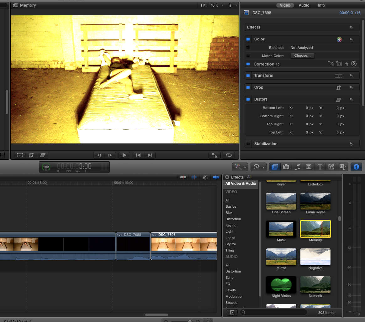
Following this, I played around with the colouring of the clip as the light slightly distorted parts of it, so this is one i looked at. It is obviously too yellow and in the end I decided on just adjusting the contrast and hues of the clip, if we are to use this in the end definitely then we'd have to apply it to all the clips.

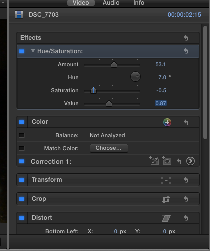
These are the settings I used for the clip in the end, I sightly adjusted the hue and saturation of the clip so that they match better, as seen when you watch it. However, in the next part of the sequence the girl jumps up in front of the camera and there is an issue; the lighting is slightly different, meaning we will have to use our editing skills to make this appear more professional.
After this, I detached and muted the audio. We will later add the sounds.
Evaluation:
Later when we come to edit this more, we'll have a non-diegetic sound, then silence, the a loud noise e.g. a boom when she jumps up. I liked the saturation etc that I used, however, this may prove a nuisance for editing the rest of the sequence, plus it may look weird in other lighting. I am pleased though with the results and want to now look for non-diegetic sounds to use over the top.
Firstly I selected the clips I was going to use which required careful selection and comparison between clips. Then I used the blade tool to crop bits off that were shaky or too long, as this would make our sequence look unprofessional.
Luckily, when we filmed this part of our sequence we remembered to leave darkness for a few moments before turning the light back on, making the editing process a lot quicker and easier. I then stitched the sequences together.
Following this, I played around with the colouring of the clip as the light slightly distorted parts of it, so this is one i looked at. It is obviously too yellow and in the end I decided on just adjusting the contrast and hues of the clip, if we are to use this in the end definitely then we'd have to apply it to all the clips.
These are the settings I used for the clip in the end, I sightly adjusted the hue and saturation of the clip so that they match better, as seen when you watch it. However, in the next part of the sequence the girl jumps up in front of the camera and there is an issue; the lighting is slightly different, meaning we will have to use our editing skills to make this appear more professional.
After this, I detached and muted the audio. We will later add the sounds.
Evaluation:
Later when we come to edit this more, we'll have a non-diegetic sound, then silence, the a loud noise e.g. a boom when she jumps up. I liked the saturation etc that I used, however, this may prove a nuisance for editing the rest of the sequence, plus it may look weird in other lighting. I am pleased though with the results and want to now look for non-diegetic sounds to use over the top.
1.14 Onwards:
Monday, 10 February 2014
Possession Editing
Through research into films of the supernatural horror we noted that a simple yet effective technique to emphasise and add to the possession feeling was to take different segments from a long clip and put them in a different order in quick succession. This editing technique makes the movements of the individual seem much more jolty and unnatural which conforms more to the supernatural horror genre than a human's real movements.

We selected a relatively long clip which is made up of a single take and located parts of the clip which we found had good movements which were able to be edited well to good effect using this technique. The clip we chose is one of the raw takes from our opening sequence which features during the early stages of possession.

During the first attempt, we separated two segments from the clip and changed the order in which they appeared in the clip. This first attempt resulted in the segments being far too long which did not make the character's movements seem possessed and unnatural. This meant that the cuts between the shots were not quick enough in order to create the desired effect. Also, the clips were taken from an area of the main clip which are too close together resulting in similar movements of the possessed character. This means that the audience would not be able to decipher the changes between the cuts as easily as if they were taken from more obviously different parts of the clip.

Our second attempt worked well as the segments were much shorter which meant they were much quicker when played back, giving a stronger sense of possession. Despite this, I thought that the segments could be shorter in length to speed up the changes between segments to further create a sense of possession within the character's movements.

The segments created were quicker which made the sense of possession feel much more intense and which conformed more to the supernatural horror genre. The quick cut edits between the segments made the overall clip seem much more unexpected and sudden which resulted in a much more possessed-like clip in general. The sudden nature of the editing used in the clip makes the possessed character's movement seem much more shocking to the audience and are made more effective than if we decided to use natural movements.

Even though we were satisfied with how the editing made the clip seem much more effective in how a sense of possession was presented, we decided to make the segments even shorter and put them in even closer proximity. This resulted in a more effective outcome as we concluded that when the segments are shorter and the clip is made more abrupt in general, the more possessed the character seems. The clip was trimmed at the beginning and end to only show the part which we edited and experimented on. The final clip from our experiment can be viewed below.
Sunday, 2 February 2014
First attempt of adding titles


We both decided on a font we liked the best called 'Trajan Pro' as we thought it fitted our opening the best, we then added some effects to it such as 'Bad TV' which blurred it and made it jolt around like a recording camera, we thought this looked effective. But this is just one of many ideas we can try for our titles and discuss with the rest of our group.
This is a rough edit of the title put in with what we have edited so far, to show the full effect we have put on it:
Evaluation:
We both agree we like the font that we chose, and we will show it to the other two people in our group to see if they agree with us. If this is what we choose to use as our final titles, our next job will be to properly edit them in with the rest of our filming so it runs smoother than the example we have displayed above. We may experiment with some more font types and effects to see if we like any others better than the one we have chosen, but if not this will be the one we go forward with.
Friday, 31 January 2014
Opening Jump Editing
After researching different horror films, especially those of the supernatural horror genre, we concluded that a scary 'jump' into the camera by the possessed character is usually used at the height of a suspense-filled build up within a scene. This is designed to scare the audience by appearing suddenly very close to the camera in a single,quick movement. The effect of this part of a sequence is crucial as films of the supernatural horror genre generally rely on very scary and jumpy parts to make the film successful as it conforms greatly to the genre.
First we located the raw footage of the possessed character performing the jump. Our main objective to make the jump successful in the way it would affect the audience was to speed up the actual jump in the clip and cut it off to keep the character in shot for a very short time, causing it to feel very abrupt to scare the audience.

Although we wanted to speed up the physical jump within the sequence, we wanted to leave the build up where the room and bed are both empty at normal speed to make it look natural. In order to speed up the jumping part of the but keep the build up at its original and normal speed, we needed to separate the clip just before the jump in order to work with two separate clips and apply the different speeds accordingly. We did this using the programme, 'Final Cut Pro' and used the 'blade' tool to separate the clip.
We then experimented with different speeds for the jump part of the clip and decided to speed it up to '147%' in speed (with 100% being normal speed). We thought this speed was effective as although it was scary and would bring out a reaction from the audience, the speed does not make the movement of the girl seem too unnatural. During experimenting with the clip by applying different speeds, we found some speeds (such as x2 the original speed) that made the jump seem unnatural and amateur-looking.

We also decided not to apply visual effects to the general clip such as a darker filter to create a more eerie atmosphere, however we decided against this as we wanted the clip to visually fit into the finished opening of our film. We also understood that non-diegetic sound is a crucial part in creating a successfully scary effect and feeling however we have not yet created original sounds to accompany this part of the opening sequence and therefore could not yet add it into the clip until later on in the post-production stage of our opening sequence.
Evaluation:
To get our chosen speed, a few trials had to be carried out. After noting that 'x2' wouldn't work well along with the other 're-time' options, we figured out that the percentage speeds were the best option. By changing the original percentage speed to 147%, this appeared more realistic and appropriate for the supernatural genre. Overall, although a few tests had to be carried out in order to identify our correct speed, the task went well, having finally selected our correct speed.
Sunday, 24 November 2013
Deconstruction of The Devil Inside - Possession Editing
'The Devil Inside' is a documentary-style film made in 2012 following a woman who wants to find out about her mother, who murdered 3 people, after being possessed by a demon. Naturally, the film involves scenes of possession which helps us with inspiration and ideas for editing technique.

Firstly, there is use of special effects in this film as they make the body twist and contort in ways that appear unnatural and therefore make it seem as though the character is possessed. This is quite common and is expected when watching a possession film. There is also the use of non-diegetic sound at this point (cracking of bones) to further creep the audience out and take it a step further.
 During this sequence there are straight-cut edits to jump between different points of view, adding to the chaos of the sequence. It makes the audience feel disorientated and anxious as the cuts are fast and jumpy.
 Again, special effects are used in this film, in the picture it is clear that the body has risen in the air in an unnatural manner, as if she is possessed. This adds an element of supernatural to the film and creates an illusion of possession.
 Sometimes the film is edited to distort the image, like in this example. It is black and white and seems to be malfunctioning. This is common in supernatural films as it is believed that demons/spirits interfere with camera equipment. This adds to the realism of the film and makes the character seem demented and twisted.
 In this image the character looks even more crazed and demented as her teeth are distorted and made to look like sharp fang-like teeth, through manipulating the image in post-production. For the audience this adds to the idea of the possession and has connotations of the devil and evil in general.
As well as this, they have used a professional looking font to make it look like a real tape, adding to the realism of the sequence. Also, if it looks real then this is more likely to scare the audience.


Firstly, there is use of special effects in this film as they make the body twist and contort in ways that appear unnatural and therefore make it seem as though the character is possessed. This is quite common and is expected when watching a possession film. There is also the use of non-diegetic sound at this point (cracking of bones) to further creep the audience out and take it a step further.


As well as this, they have used a professional looking font to make it look like a real tape, adding to the realism of the sequence. Also, if it looks real then this is more likely to scare the audience.

Also, as this is a documentary-style film they have clips from supposed real life exorcisms. Here, it is the camera man filming a clip being shown to some of the characters. The clip is in night-vision and very grainy. This adds to the realism of the clip and tries to make it look authentic to go with the documentary-style. It also means that the audience can't see what is going on very well, meaning there is a build up of tension and fear as they don't know what is coming.
Evaluation
For our own possession, I feel we should use visual elements as well as sound elements to make it as scary as possible. Using filters and blurriness could be good as it would be easier to do on an editing software than acting. Also, the cracking of bones could be easy to recreate as we could use a whole host of objects, like twigs, to crack and it would make it seem like the bones were bending unnaturally.
Evaluation
For our own possession, I feel we should use visual elements as well as sound elements to make it as scary as possible. Using filters and blurriness could be good as it would be easier to do on an editing software than acting. Also, the cracking of bones could be easy to recreate as we could use a whole host of objects, like twigs, to crack and it would make it seem like the bones were bending unnaturally.
Monday, 21 October 2013
Deconstruction - Natural Born Killers opening
Deconstruction of Natural Born Killers opening 1 minute - editing and camera movements/shots
 This
sequence includes a variety of different editing techniques as well as camera
angles and movement. Many of the shots seem frenzied and almost disorientating,
for example, when Mallory is dancing there is use of titled shots and zooming
in and out which helps the audience to see Mallory’s whole body and the way
that she is moving and also the music she is dancing to. Furthermore, many of
these shots are low angle shots which make her look confident, impressive and
superior. The shots all include her as the main attraction and this links back
to my previous point. Adding to this, there are straight-cuts throughout her
dancing, constantly switching angles and showing different parts of her body to
add to the image being presented of Mallory.
This
sequence includes a variety of different editing techniques as well as camera
angles and movement. Many of the shots seem frenzied and almost disorientating,
for example, when Mallory is dancing there is use of titled shots and zooming
in and out which helps the audience to see Mallory’s whole body and the way
that she is moving and also the music she is dancing to. Furthermore, many of
these shots are low angle shots which make her look confident, impressive and
superior. The shots all include her as the main attraction and this links back
to my previous point. Adding to this, there are straight-cuts throughout her
dancing, constantly switching angles and showing different parts of her body to
add to the image being presented of Mallory.
 There is
also a two-shot of Mickey and another man, in a titled shot still where the man
makes a rude remark about Mallory. It then switches abruptly to a black and
white shot and then quickly a frenzied low angle shot of Mickey with blood all
over his face and then it zooms in closer to a close-up of his blood stained
glasses. This is effective as it shows Mickey’s psychotic side and gives an
insight almost into Mickey’s mind and personality; it gives the audience a
glimpse of what is to come. It then switches back to a black and white shot of
Mickey sipping his drink in slow-motion, almost as if he is processing the
words that the other man had just said. All of these chaotic changes between
shots help add to the chaotic build up happening in the film.
There is
also a two-shot of Mickey and another man, in a titled shot still where the man
makes a rude remark about Mallory. It then switches abruptly to a black and
white shot and then quickly a frenzied low angle shot of Mickey with blood all
over his face and then it zooms in closer to a close-up of his blood stained
glasses. This is effective as it shows Mickey’s psychotic side and gives an
insight almost into Mickey’s mind and personality; it gives the audience a
glimpse of what is to come. It then switches back to a black and white shot of
Mickey sipping his drink in slow-motion, almost as if he is processing the
words that the other man had just said. All of these chaotic changes between
shots help add to the chaotic build up happening in the film.
 This
sequence includes a variety of different editing techniques as well as camera
angles and movement. Many of the shots seem frenzied and almost disorientating,
for example, when Mallory is dancing there is use of titled shots and zooming
in and out which helps the audience to see Mallory’s whole body and the way
that she is moving and also the music she is dancing to. Furthermore, many of
these shots are low angle shots which make her look confident, impressive and
superior. The shots all include her as the main attraction and this links back
to my previous point. Adding to this, there are straight-cuts throughout her
dancing, constantly switching angles and showing different parts of her body to
add to the image being presented of Mallory.
This
sequence includes a variety of different editing techniques as well as camera
angles and movement. Many of the shots seem frenzied and almost disorientating,
for example, when Mallory is dancing there is use of titled shots and zooming
in and out which helps the audience to see Mallory’s whole body and the way
that she is moving and also the music she is dancing to. Furthermore, many of
these shots are low angle shots which make her look confident, impressive and
superior. The shots all include her as the main attraction and this links back
to my previous point. Adding to this, there are straight-cuts throughout her
dancing, constantly switching angles and showing different parts of her body to
add to the image being presented of Mallory.
This ‘impressive’
Mallory is then shown to be a bit shyer and meeker when another man comes to
dance with her, as the shots focus on his facial expression and are again in
black and white. The shots show him dancing rudely and in a provocative way
towards Mallory, which she is obviously uncomfortable with, through the use of mid-shots
of her walking away and ‘calming down’ her dancing. The camera movement at this
time weaving in and out (steadi-cam) which gives an in-depth view into the
scene and the movement and shows Mallory’s discomfort and the man’s rather
forward and off-putting approach towards her and also, as a viewer, makes you
feel uncomfortable as it feels like you are up close with him too and almost as
if you are experiencing his inappropriate actions.
 There is
also a two-shot of Mickey and another man, in a titled shot still where the man
makes a rude remark about Mallory. It then switches abruptly to a black and
white shot and then quickly a frenzied low angle shot of Mickey with blood all
over his face and then it zooms in closer to a close-up of his blood stained
glasses. This is effective as it shows Mickey’s psychotic side and gives an
insight almost into Mickey’s mind and personality; it gives the audience a
glimpse of what is to come. It then switches back to a black and white shot of
Mickey sipping his drink in slow-motion, almost as if he is processing the
words that the other man had just said. All of these chaotic changes between
shots help add to the chaotic build up happening in the film.
There is
also a two-shot of Mickey and another man, in a titled shot still where the man
makes a rude remark about Mallory. It then switches abruptly to a black and
white shot and then quickly a frenzied low angle shot of Mickey with blood all
over his face and then it zooms in closer to a close-up of his blood stained
glasses. This is effective as it shows Mickey’s psychotic side and gives an
insight almost into Mickey’s mind and personality; it gives the audience a
glimpse of what is to come. It then switches back to a black and white shot of
Mickey sipping his drink in slow-motion, almost as if he is processing the
words that the other man had just said. All of these chaotic changes between
shots help add to the chaotic build up happening in the film.
Subscribe to:
Posts (Atom)