Follows the Priest around in his day-to-day life.
 Production company info etc at start
- Lionsgate
- Strike
- Studio canal
Could be important to note for our film what production companies etc are used in this type of horror film. Also, there were no opening credits during this sequence.
Sound
- Diegetic sound - people talking, organ / church music in background, scribbling on paper - helps with realism, also helps set the scene. And appropriate for genre as reference to religion is made.
- No non-diegetic music as nothing supernatural has happened yet, the film starts quite happily which contrasts with a lot of other film openings in this genre.
Mise en Scene + Lighting
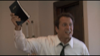
- Bible - reference to religion which is appropriate for genre
- Naturalistic lighting throughout - add to realism
- Some low-key lighting with ambient lighting, helps set the 'home' environment, shows his family-orientated personality, also he is doing a magic trick, shows his versatility as a character.
- Presented as a 'good guy' and 'family man', as his body language and facial expression shows him being jokey with hi s son and being a good parent.
- Some of the sequence is set within a Church, again appropriate for genre, begins to give the audience an idea of what may happen later in the film.
- Same Bible as before - some sort of special relationship? Starts to give the audience questions about the character
- Main character always smartly dressed in a suit - makes him look professional, reliable, smart - building to the character and letting the audience know he is a trustworthy guy.

With son
Church setting
Same Bible?
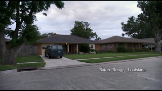
Editing- Place name edited onto the shot, makes it look like a documentary-style film. This also adds to the realism and authenticity of the film, makes it more believable for the audience.
- Straight cut edits - documentary style
- Includes 'childhood pictures', editing in like a documentary, adds to realism of the sequence as well.
- Use of interviews, 'natural shots', planned shots - makes it appear like a documentary all edited together.

Camera Angles / Movement
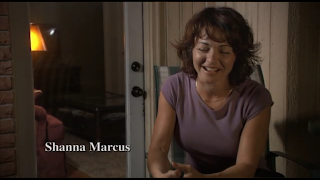
- Mid-shots and close up shots for 'interviewing' parts of the sequence - like a documentary. Adds to the realism of the film.
- A lot of the shots are a bit shakey, because we are made to believe it is being filmed on a camera on somebodies shoulder, to look like a real documentary
- Over the shoulder shot of the character scribbling on paper whilst reading Bible, shows his dedication
- Sudden zooming shots when preaching, highlights his movement and enthusiasm whilst he works.
- An example of where camera movement is used - an establishing shot of the Chuch, zooms in slightly so audience can clearly see what the building is - also keeps in touch with the appropriateness for genre
- Establishing shots used frequently to show the setting of the sequence, works with the documentary style it is.


No comments:
Post a Comment